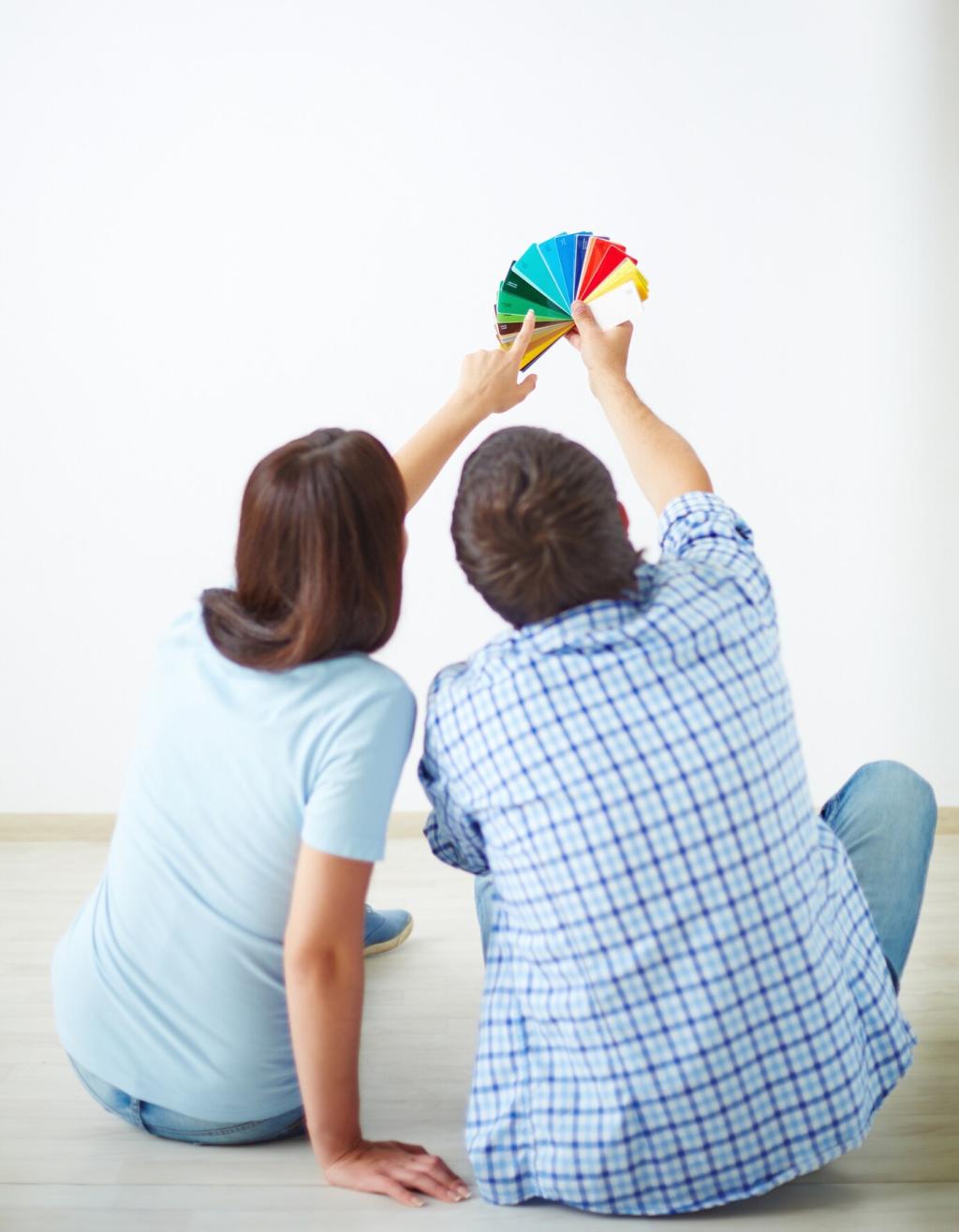
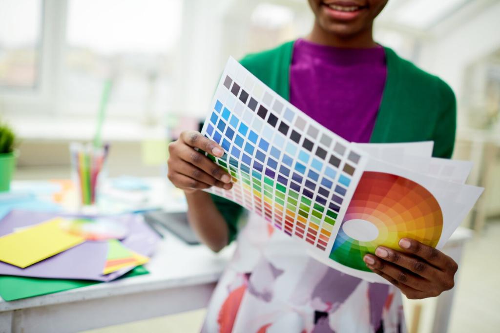
Trending Interior Color Schemes—and How to Apply Them
Chosen theme: Trending Interior Color Schemes and How to Apply Them. Explore fresh palettes, practical methods, and real-world tips that help you turn inspiration into livable, personal color stories in every room of your home.
Calm Meets Optimism
After years of uncertainty, palettes blend grounding neutrals with hopeful pops—think mushroom walls with a splash of coral or electric blue textiles. This balance delivers serenity without dullness, inviting you to breathe deeper while still feeling energized at home.
Nature Is Back, With Nuance
Biophilic greens and earth tones continue to rise, but with richer, more complex undertones. Sage deepens to laurel, terracotta leans cinnamon, and sand turns to pebble gray. Share your favorite nature-inspired corner to inspire others exploring the same organic direction.
Digital Daring, Real-World Restraint
Bold colors trending on screens—viva magenta, chartreuse, cobalt—arrive at home in measured doses. Try a statement chair, lamp, or trim line before committing to a full wall. Comment with your experiment and tell us what surprised you most about living with it.
The New Neutrals: Greige, Mushroom, and Soft Stone
01
Layering Tones, Not Just Shades
Start with a mid-tone base like mushroom, then layer lighter putty on the ceiling and a deeper taupe on baseboards. Add nubby textiles and pale oak to create visual warmth. Subscribe for our monthly neutral mood boards and downloadable paint pairing cards.
02
Undertones Decide Everything
Warm greige with pink undertones plays beautifully with brass and terracotta, while cooler stone reads best with chrome and navy. Test swatches on two walls and check them morning, noon, and night to catch the undertone’s true character.
03
From Builder Beige to Bespoke Quiet
A simple swap from flat beige to luminous stone gray instantly modernizes trim, doors, and closets. Try a satin finish for durability and a subtle glow. Post your before-and-after photos; we love featuring reader transformations built on elegant restraint.
Blue-Green Serenity: From Coastal Mists to Forest Depths
For sunlit rooms, try pale mineral blue with a matte finish; in dim corners, choose saturated laurel green in eggshell for extra light bounce. Balance with warm woods to avoid a sterile feel. Comment with your room’s light situation for shade recommendations.
High-Contrast Pops: Viva Magenta, Cobalt, and Chartreuse
Let a neutral dominate seventy percent, a secondary hue twenty, and reserve ten percent for a bold accent like chartreuse. This ratio keeps focus while still celebrating color. Tell us your planned trio, and we’ll suggest a fail-safe accent object.
High-Contrast Pops: Viva Magenta, Cobalt, and Chartreuse
Paint a cobalt rectangle behind shelving or a magenta stripe across a hallway to guide the eye and add architecture. Use painter’s tape and a level for sharp lines. Drop your layout sketch, and we’ll help refine scale for maximum impact.
Monochrome Layering: Tonal Rooms with Quiet Drama
Build a tonal scheme from a single undertone—blue-based gray, red-based beige, or green-based taupe. Mix two shades lighter and one darker for trim and doors. Share your paint short list; we’ll help you avoid clashing undertones before you buy gallons.
Small Spaces and Rentals: Color Without Consequences
Peel-and-Stick, But Elevated
Use peel-and-stick paint swatches to trial large color areas, then commit to removable wallpaper in subtle stone, sage, or clay. Frame panels like art for a designer finish. Comment with your wall size; we’ll calculate pattern repeats for minimal waste.
Textiles as Paint
Curtains, rugs, and bedding deliver color at scale without a brush. Layer a cobalt throw over mushroom bedding, then anchor with a clay rug. Swap seasonally to keep the palette dynamic. Share your textile palette, and we’ll suggest harmonious accent lighting.
Furniture as Flexible Color
Choose a statement dresser or headboard in a trend hue that moves with you. Repaintable pieces become your evolving color laboratory. Tell us your thrifting finds, and we’ll recommend primers and finishes to make those colors last through everyday life.
Finishes, Ceilings, and Trim: The Secret Color Surfaces
Paint ceilings one or two steps lighter than the walls for lift, or try a moody, low-LRV shade to make large rooms intimate. Soft blue ceilings complement green-gray walls beautifully. Ask us which ceiling hues suit your room proportions and daylight.
Finishes, Ceilings, and Trim: The Secret Color Surfaces
Color-drenched trim—think stone-gray on mushroom walls or olive on cream—feels modern and architectural. Semigloss adds crisp edges that emphasize lines. Post your floor color; we’ll suggest trim shades that unify baseboards, casings, and doors flawlessly.